Themes & Styling
A theme controls the entire visual look of the diagram — colors, typography, line treatment, and per-class default styles. Switching the theme restyles the whole diagram in one step.
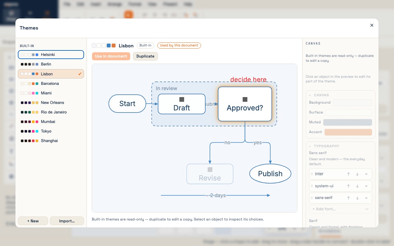
Built-in themes
Ten themes ship with expono, each named for a city. Two are the quiet ones; the rest have a color and, in four cases, a gradient on the shapes.
| Theme | Character |
|---|---|
| Helsinki | Light. Clean Nordic paper — the neutral baseline, good for bright rooms and handouts. |
| Berlin | Dark. Stark graphite — the neutral dark counterpart, for dim rooms and projectors. |
| Lisbon | Light. Cobalt azulejo tiles on white, terracotta accent, golden highlight. |
| Barcelona | Light, warm. Gaudí mosaic — sandstone, teal, terracotta. |
| Miami | Light. Art-Deco pastels — flamingo, aqua, blush — with a flamingo-to-lavender gradient. |
| New Orleans | Dark. Mardi Gras — royal purple, gold and green. |
| Rio de Janeiro | Dark. Tropical — a jungle-green-to-ocean-blue gradient over deep teal, Brazil-yellow accent. |
| Mumbai | Dark. Saffron and marigold on deep maroon, magenta accent. |
| Tokyo | Dark. Neon night — a magenta-to-violet-to-cyan gradient on near-black indigo. |
| Shanghai | Dark. Bund Art-Deco — imperial red and gold, an oxblood-to-amber gradient. |
Built-in themes are read-only — you can browse and use them but cannot edit them directly. To customize, duplicate the theme first.
Applying a theme
Click an empty part of the canvas and the Inspector shows the Document: its Theme dropdown switches the theme in one step, and Edit themes… opens the Theme Studio. Format → Themes… opens the Studio too; there, click a theme to preview it and Use in document to apply it.
The Theme Studio
Open the Theme Studio with Format → Themes…. It has three panels:
Left: theme list
All themes grouped by origin: Built-in, Library (installed on this machine), and This document (embedded in the current file). A ✓ badge marks the document's active theme. Clicking a theme previews it without applying it — the canvas stays unchanged.
Center: live preview
A fixture mini-diagram rendered through the selected theme: a frame containing two connected shapes (one highlighted), a standalone shape, a text block. The preview updates instantly as you edit the theme. Click any element in the preview to open its style controls in the right panel.
Right: theme inspector
When an element in the preview is selected, the controls for that element class appear — colors, border style, fill, fonts. Edits write back to the theme immediately. Click the canvas background to edit global canvas colors (background, surface, muted, accent).
Customizing a theme
-
Open the Theme Studio
Format → Themes…
-
Duplicate a built-in theme
Select a built-in theme and click Duplicate. A copy appears in the Library section with "(copy)" appended — now editable.
-
Edit colors
Click elements in the preview to select their class. Click a swatch to pick a new color. Changes apply immediately to the preview.
-
Edit typography
The Typography section lists the fonts for each role — sans serif, serif, mono — in order of preference. Add a font, reorder them, or remove one; a shape label, a text box and a frame label each use one of the roles.
-
Apply and save
Click Use in document. The theme is saved to your local library and embedded in the project file when you save.
What a theme controls
| Theme property | What it affects |
|---|---|
| Color palette | Background, surface, muted, accent, plus per-class role colors (nodeFill, nodeStroke, edgeStroke, frameFill, frameBorder, textColor…) |
| Font map | What font stack "sans", "serif", and "mono" mean. Shape labels, text blocks, and frame labels each use one of these roles. |
| Density | Spacing factor applied across the diagram (compact, normal, spacious). |
| Per-class style defaults | Default border style/weight, fill mode, and pattern for shapes, shapes, frames, connectors, and lines — so new elements get the theme's look out of the box. |
| Accent color | Used for selection chrome, flow animation dots, emphasis glow, and any element painted with the "Accent" role. |
Per-element style overrides
Every element can override any style property that the theme provides. Overrides are sparse: only the fields you change are stored; anything left at Default resolves from the theme at render time. This means changing the theme still restyles the whole diagram, except for fields you've explicitly pinned.
Override controls live in each element's inspector:
- Color fields — choose Default (follow the theme role), a named theme role, a gradient, or Custom… to pick any color. The swatch always shows the resolved color, so you can see the theme color even when Default is set.
- Border style — none / solid / dashed / dotted. Default follows the theme's class default.
- Border weight — Auto (theme default) or a specific pixel width.
- Fill — none / solid / pattern (hatch, cross, dots…).
Styling multiple elements at once
Shift/⌘-click to select several objects; the Inspector then edits them together. It includes Border and Fill sections that write to all selected elements simultaneously. Mixed values show as — until you set a new value (which overwrites all). One undo entry covers the whole operation.
Sharing and importing themes
From the Theme Studio:
- Export… — saves the selected theme as a
.xppbundle (the same format as shape packs — themes ride in the same file). - Import… — opens a file picker; the imported theme appears in the Library section.
Themes embedded in a .xpd project file are carried with it — recipients see the same look without installing anything. The Theme Studio shows these under This document with an Add to library button.