Stage Mode
Stage is where you build the diagram — the single shared canvas that all your scenes draw from. Place shapes, connect them, frame regions, and draw your own here.
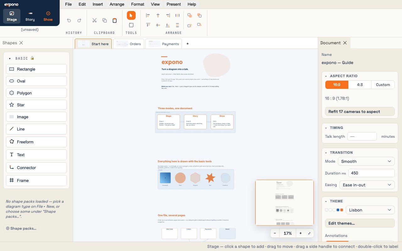
The Stage layout
| Area | Purpose |
|---|---|
| Shapes (left) | The palette: the Basic drawing tools at the top, then a group per loaded pack. Click a shape to place it, or drag it to a spot. |
| Canvas (center) | The infinite SVG canvas. Pan with Space-drag or a middle-button drag. Zoom with the scroll wheel or a pinch. |
| Inspector (right) | The selected object's properties — or the document's, when nothing is selected. |
| Ribbon (top) | The mode switch, history, clipboard, the Select and Marquee tools, and the arrange group. |
| Status bar (bottom) | A hint for the current tool, and the zoom controls. |
Tools
The drawing tools sit in the Basic section at the top of the Shapes palette, and on the Insert menu with a key each. A tool is one-shot: draw once and it hands back to Select.
| Tool | Key | What it does |
|---|---|---|
| Select | V | Click to select; Shift- or ⌘-click to add. Drag an empty area to marquee-select what it touches; a frame is included only when the marquee contains all of it. |
| Marquee | M | Always draws a selection rectangle, even when the drag starts on an object — for picking things out of a crowded diagram. |
| Rectangle | R | Drag out a rectangle. Shift for a square. Corner rounding is a dial in the Inspector. |
| Oval | O | Drag out an oval. Shift for a circle. |
| Polygon | Y | A regular polygon; the number of sides is a dial in the Inspector. |
| Star | S | A star; points and inner radius are dials in the Inspector. |
| Line | L | A line with waypoints. Click to add a point; double-click to finish. |
| Freeform | E | A freehand path drawn in one stroke. |
| Text | T | A standalone text box. Double-click any text to edit it. |
| Connector | C | Drag from one object's port to another's. You can also just drag from a port handle with the Select tool. |
| Frame | F | Drag out a labeled region. Objects whose centers land inside become its members. |
| Image | I | Place a picture from a file. Pasting an image does the same. |
| Screenshot | G | Capture a window or screen straight onto the canvas. |
Shapes — typed shapes from packs
A shape is a typed shape drawn from a shape pack — process box, decision diamond, database cylinder, etc. Its visual appearance (geometry, glyph, default style) comes from the pack definition; the file stores only the type id.
Placing shapes
- Click a shape in the palette to place it at the canvas center.
- Drag from the palette to place at a specific position.
- A placed shape is selected at once, ready to be labeled or moved.
Labeling shapes
- Double-click any shape to enter inline edit mode.
- A label wraps inside the shape's outline — inside the diamond, not just its box — and the shape grows to hold it.
- Use the Label inspector section to control font size, alignment, and placement (above, below, inside).
Resizing shapes
- Drag the blue resize handles at the corners and connectors. Hold Shift to constrain the aspect ratio.
- Scrub the W / H fields in the Inspector's Layout section for exact sizes.
- Image-glyph shapes snap to the image's native aspect ratio by default; hold Shift to free the aspect.
What the Inspector offers for a shape
| Section | Controls |
|---|---|
| Label | The text, and its font, size, alignment and placement |
| Style | A named style from the theme, or Custom |
| Fill | Color (solid, gradient, a theme role, or none) · opacity · pattern |
| Border | Color · style (solid, dashed, dotted) · weight |
| Glyph | A symbol or picture on the shape, and where it sits |
| Shape | The definition it follows, and the dials that definition offers |
| Layout | X, Y · W, H · rotation |
Connectors — connecting elements
An connector is a directed or undirected connection between two connectable elements (any shape or drawn shape). Connectors are the paths that flow animations travel.
Drawing a connector
- Hover any connectable element — blue port handles appear on its sides.
- Drag from a port handle. A live preview connector follows your cursor.
- Drop onto any port of the target element. The connector is created.
Or press C for the Connector tool and drag port to port. A pack can bring typed connectors of its own — a UML generalization, a BPMN message flow — which carry their arrowheads and dashes with them.
Routing
| Method | Behavior |
|---|---|
| Straight | Direct line between the port centers. |
| Orthogonal | Right-angle turns. Set a first-axis preference (horizontal / vertical). Corner style: sharp, rounded, or heavy. |
| Curved | Spline that leaves the source straight along its port normal and arrives at the target's natural angle — arrowheads read correctly. |
| Manual | Drag the connector or its waypoint handles to route by hand. A one-click button returns to auto-routing. |
Labels
Select an connector and type in the Label field. Nine placement options (start/middle/end × above/on/below the path). Essential for decision branch labels like "yes" / "no".
Arrowheads
The Arrows field sets none · start · end · both; a pack's caps — crow's feet, the UML triangle — are on the same control.
Avoid & hop
- Avoid objects — routes the connector around other shapes.
- Hop over crossings — draws a small arc bridge where connectors cross.
Frames
A frame is a labeled bounding region — a VPC, swimlane, phase, or trust boundary. It lives on the backmost layer so it never occludes shapes.
- Create: arm the Frame tool and drag out a rectangle.
- Membership: shapes whose center lands inside are automatically captured. When you drag a shape in/out of a frame, membership updates immediately.
- Move: moving a frame translates it and all its members together (one undo entry). Resizing only changes the frame — members stay put.
- Cascade: hiding or dimming a frame in a scene applies the same state to all its members. Internal connectors auto-hide when their shapes are hidden.
- Style: border, fill, pattern and label — in the Inspector. A pack's frames (a BPMN pool, a C4 boundary) come with their notation's look.
Drawn shapes
The Basic tools — rectangle, oval, polygon, star, line, freeform, text — make shapes with geometry of their own. They take fills, gradients, patterns, rotation and opacity like any other shape, they have ports on all four sides, and their dials (sides, points, corner rounding) are in the Inspector.
Combining
Select two or more drawn shapes and use Arrange → Combine to union, subtract, intersect or exclude them. The result is one shape with the front one's style.
Editing a shape's points by hand, and saving a drawn shape into a pack of your own, belong to the paid tier.
Selection and arrange
Selecting elements
- Click to select a single element.
- Shift/⌘-click to add or remove from the selection. The first element clicked becomes the anchor for alignment operations.
- Drag an empty area to marquee-select what the rectangle touches; press M first to marquee from anywhere.
- ⌘A selects all elements.
Arrange operations
In the ribbon's Arrange group and the Arrange menu:
- Align: left / center / right / top / middle / bottom — relative to the anchor element.
- Distribute: space elements evenly horizontally or vertically.
- Z-order: bring to front / bring forward / send backward / send to back.
- Group / Ungroup: ⌘G / ⇧⌘G — logical grouping that moves and transforms as one.
- Auto-arrange: lay the whole diagram out as a flow, a tree, a mind map or a radial; Tidy up squares what is there.
- Lock: ⇧⌘L — a locked object cannot be moved or edited until unlocked.
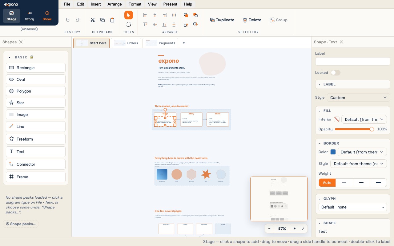
Clipboard
| Action | Shortcut | Notes |
|---|---|---|
| Cut | ⌘X | Cuts selected elements. In Story mode, cuts selected annotations from the current scene. |
| Copy | ⌘C | Also copies a PNG rendering of the selection to the OS clipboard. |
| Paste | ⌘V | Pastes with cascading offset. Connector endpoints are remapped to the new copies. Referenced image assets are carried over. |
| Paste image | ⌘V | Paste an image from another app → creates a borderless image-glyph shape. |
| Paste text | ⌘V | Paste plain text from another app → creates a text element. |
| Duplicate | ⌘D | Copies and pastes in one step, offset by 24px. |
Camera and zoom
- Scroll wheel — zoom in/out centered on the cursor.
- Pinch gesture (trackpad) — zoom.
- ⌘0 — zoom to fit all content.
- Space-drag or a middle-button drag — pan.
- View → Show overview — a small map of the whole diagram; drag its viewport to pan.